Bakery App Ordering Case study
PROJECT OVERVIEW
The problem:
People need an easy and efficient way to place group bakery orders from Bri’s Bakery, especially when in a busy environment with limited time.
The goal:
Design a mobile ordering app for Bri’s Bakery that will let users place group orders easy and efficiently.
In this case study, I was able to :
- Identify a problem
- Identify pain points
- Create personas and user journeys
- Design paper and Digital wireframes
- Create a Low-fidelity prototype
- Perform a usability study
- Create a High-Fidelity prototype
- Consider Accessibility within UX design
- Evaluate takeaways and next steps
UNDERSTANDING THE USER
User Research:
I conducted interviews and created empathy maps to understand the users I'm designing for and their needs. A primary user group identified through research was professional young adults who don't have time to place group bakery orders. This user group helped highlight that most people who order on mobile apps have limited time and those who place group orders more than once weekly tend to be those who order from an office.
User Pain Points:

Personas:


User journey map:
A mapping of Becky’s User journey to see how helpful the mobile bakery ordering app would be.

STARTING THE DESIGN
Paper Wireframes:
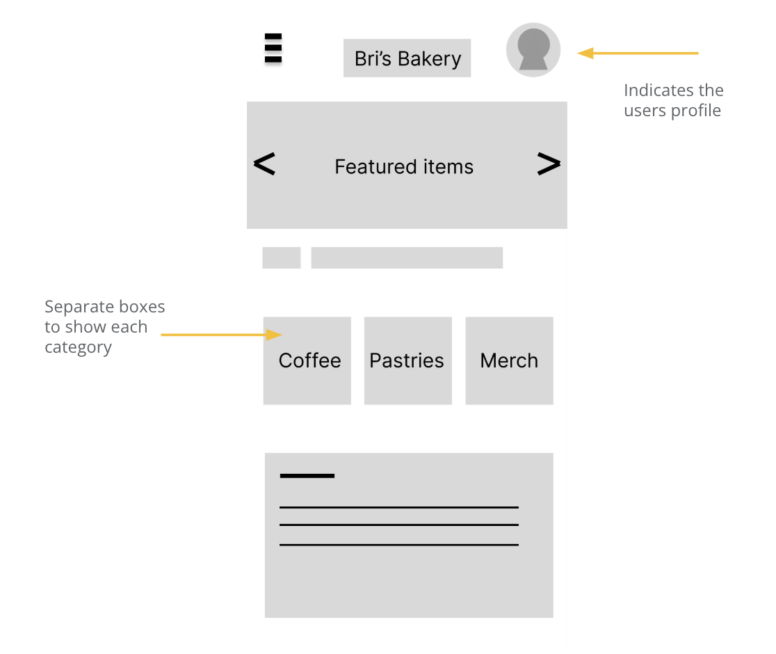
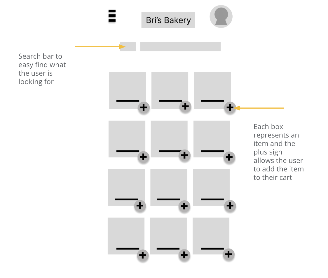
This is my first paper wireframe daft for the bakery app. I tested with 5 wireframe sketches to get ideas of different screen iterations. This process ensures that the digital wireframes will be well-suited to address user pain points.

Digital Wireframes:
Next, I chose the best design from the paper wireframes and created it in Figma. I then created additional app pages in Figma to represent a user flow.


Low-fidelity Prototype:
I created a low-fidelity prototype in Figma to tie together the screens and create a user flow. Link to Figma
Usability Study:
I asked five individuals to test the low fidelity prototype and they gave the following suggestions on the below board. I then created my top three findings.

REFININGTHE DESIGN
Theme: Confusion on lack of credit card and pick up details on order page
Goal: Update checkout flow to include credit card input

Theme: Confusion on cart editing
Goal: Add in more editing options and clear steps

Theme: Confusion what step they are on and if the action worked
Goal: Add further confirmation for the user on what step they are on and if it was successful

Key Mockups:
I implemented design and prototype updates after user testing. I also tested out some design elements like color.

High-fidelity prototype:
I re-modified some of the color design and took suggestions from the user testing. I edited the mockups and prototype to create a high-fidelity prototype. Figma link here.
Accessibility Considerations:

Next steps:

TAKEAWAYS
Impact:
These designs will help users easily be able to order bakery items via mobile fast and efficiently. We will track number of downloads and follow up with user feedback surveys.
What I learned:
I learned that designs should be created for mobile first and then worked on for larger screens later. So before creating this website, I was able to test and design for a bakery app. Some of the designs changed between the two, but it was really good practice to design for both. I learned about how to do user research, design, testing, and implementation within a UX designers process.
